07. Exercise: Scatter Plots
Exercise: Scatter Plots
Scatter plots are useful for displaying bivariate numerical data. This means a data set with two variables, such as height and weight measurements for a list of human beings.
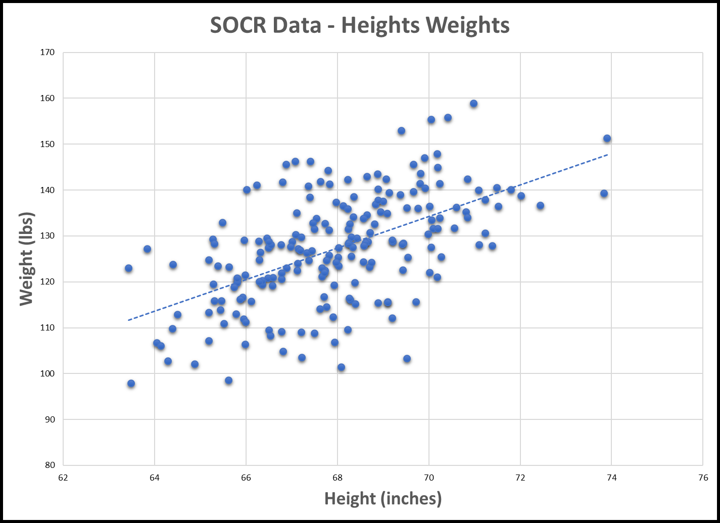
If the data of both variables moves up together, they have a positive correlation, and this can be seen in the scatter plot, such as in the following plot of human height and weight data. We can see that generally, as height increases, so does weight. The line shown is the "trend line", which can be added in Excel by selecting the scatter chart, then Design->Add Chart Element->Trendline->Linear

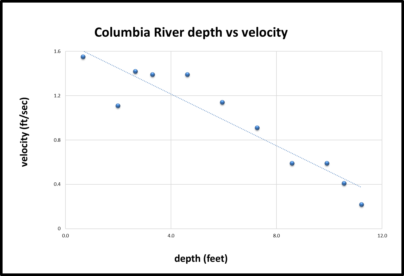
If one variable increases as the other decreases, the two variables have a negative correlation, as in the following plot of depth vs velocity in the Columbia River:

For this exercise, open the provided spreadsheets, create scatter plots as requested, and answer the questions about the general correlation for each.
Task Description:
The following list has a series of steps for this exercise. As you complete each step, check it off the list. The quizzes in the task list can be found below.
Task Feedback:
Congratulations!
Butter Clams
SOLUTION:
Positively CorrelatedLake Superior